Narnia Tribute Piece and Process
I recently finished a piece for an upcoming show at Gallery 1988 (East) in LA on October 29. The piece will be featured in a collective show titled “Tiny Tales” where all of the artwork will be based on classic children’s books. As much as I would’ve love to paint “The Little Prince” or “The Hungry Caterpillar” or any of the Roald Dahl books, but I get most excited about “Chronicles of Narnia” by C.S. Lewis. There is something about the way that Lewis’ ability to paint a vivid world in a reader’s mind that the recent films have failed to achieve. In his words, Narnia feels like a comfortable home, like a familiar place you always look forward to visiting on a summer break.
Today, I’d like to show a bit of my process for this painting and the steps and decisions I made to finish it. It was a difficult piece to pull off, and there were a few moments where I almost called it quits. Fortunately, I was able to push through, and with some encouragement from Olwen and friends, I was able to complete it.
I always tell people that drawing is a mental activity, and a bit of time was spent trying to plan out the piece. The first decision I had to make was the subject matter. At first, I thought about doing a piece based on the “The Lion, the Witch and the Wardrobe” since that was probably the most popular title out of the series, and it there were a few moments in the story that could have been potential candidates. But I wanted to do a piece that not only a specific scene from the books but was also able to reflect the heart of the series. I didn’t think any of the scenes from TLTWATW fit that description. (For example, a lot of people have drawn Susan and Lucy Pevensie dancing with Aslan or riding on his back after his resurrection. While it is a nice scene, in my opinion, Susan didn’t represent the heart of the series. I’m not going to play spoilers here, but if you’ve read the whole series, you would understand how Susan’s progression through the series informed this decision.) Eventually, I picked a scene from “Prince Caspian” where Aslan reunites with Lucy in the forest of dancing trees. I wanted to capture the feeling of joy for Lucy after being doubted several times by her siblings for seeing him. Lucy represented child-like innocence and steadfast faith that was eventually rewarded by Aslan. To me, this was the heart of the series.[/vc_column_text][/vc_column][/vc_row]
With regards to the medium, I decided to do a digital piece for the sake of time, but there were also a few effects I wanted to try that I couldn’t do in watercolors. The piece was done entirely in Photoshop using a Wacom Cintiq. While there might be a perception that it would be easier for me to do digital paint, it ended up being a much more difficult piece than I anticipated. I nearly gave up and switched to ink, but I managed to push through.
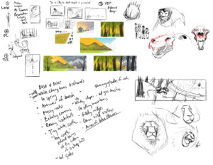
Once I had my main idea, I started gathering reference materials. Usually this involves jumping on to Google Images and finding photos of lions, trees, grass, ferns, and even some photos from the recent Narnia films. The photos are only meant to be used as reference, never copied or traced. I make quick notes and messy sketches to figure out the composition of the characters.
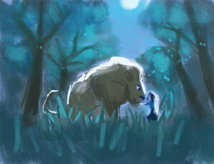
Once I get a feel for what I want to draw, I make a quick color key to establish the mood of the piece. A color key is a like a quick paint sketch that serves as a guide towards the final product. The scene calls for Lucy waking up in the middle of the night and walking through a grove of tree spirits that are beginning to wake up. Being a night scene meant that there would be a lot of blue and dark values, and it’s in the color key where I try to figure how to balance the image without investing too much time in the details.
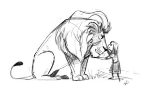
The next step was to design the characters, so I made rough sketches of Aslan and Lucy. Usually after I make a rough drawing, I draw over it again, making slight adjustments to get the right shapes and proportions. Once I’m satisfied with rough, I can move on to the environment. I try not to do too many redrawings because there’s always the danger of the drawing looking stiff and rigid.
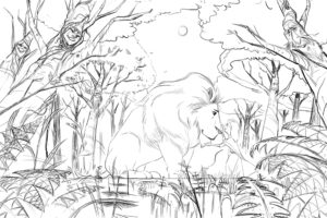
One of the troubles I had throughout the process was how to design the environment elements like the trees and ferns. I would’ve been fine drawing a regular tree, but I wanted to add some design to them to make them interesting enough to look at (but not too interesting to distract from the main idea). The ferns were probably the hardest thing for me to figure out. Fern leaves are like fractal shapes meaning that there are repeating shapes within the overall shape (the triangular leaves are made of smaller triangles which are made of smaller triangles, and so on). Eventually for the sake of time, I went with a simpler solution.
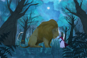
I resized the color key slightly larger than the final piece, and it’s time to paint. This stage is a little daunting at first because I’m setting the foundation for the whole painting. It involves a lot of big blocks of color and not getting in too deep with the details. I try to paint in one section for a moment and then move on to another part of the canvas so I can get cohesive feel to the painting.
 I use a combination of purchased and my own customized Photoshop brushes. I really like Kyle Webster’s brushes, and many artists in the entertainment industry swear by them. The ones I have are the “Ultimate Megapack” and the “Ultimate Real Watercolors.” They’re definitely worth the price, and I encourage anyone interested in digital painting to eventually make the investment. Plus you’ll be supporting another artist!
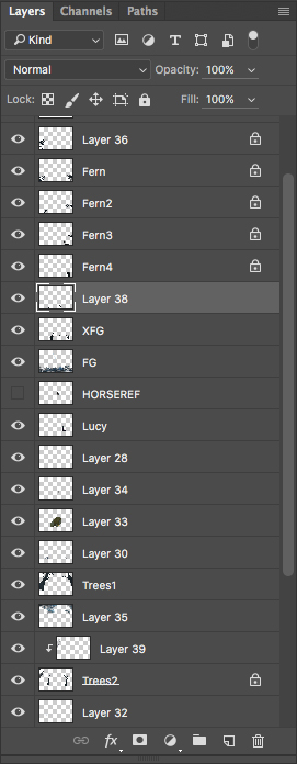
Normally when I paint, I start out by painting elements in separate layers and merging them later. You can see in the image below that the layer count got a bit excessive once I blocked all of the essential elements. I use a lot of layers so I can edit certain elements individually. So if one of the trees is on a separate layer, I can erase one of the branches without erasing the entire background with it.
I also use layers for their blend modes. If you select one of the layers and click on the dropdown menu just above the layers, you can change the way the layer is displayed. I won’t go into blend modes too much, but you can read more about it here on Adobe’s site.
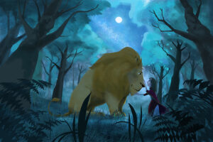
At this point, I’m trying to figure out how to render the trees. I initially made them big solid blobs, but I wanted the light to shine through the canopies. I did a similar piece before that had tree canopies, and I remember how much of a pain it was back then. As I was painting during this stage, I was feeling pretty anxious about how I was going to finish this piece. I ended up spending a lot of time noodling with the tree canopies that I nearly gave up at this point. I finally decided to start over with the tree canopies and take a new approach.
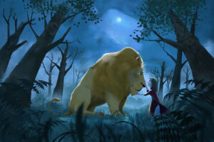
Using a custom-made brush, I start working on the leaves. Working with textured surfaces like hair and leaves requires a little bit of patience and layering. I try to keep things loose and not have to detail every single leaf and branch because a lot of it will get lost once I start introducing mist and color adjustments. One of these days I’d like to simplify my style so I wouldn’t have to render complicated subjects like these. One day…
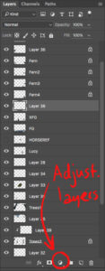 I start making color adjustments, making sure that the eyes are being drawn to the focal point between Aslan and Lucy. I use adjustment layers which can be found at the middle bottom of the layers panel, it’s the half-filled circle icon. I tend to use “Levels,” “Hue and Saturation,” and “Curves” usually after I’ve done most of the painting. Occasionally I might add an adjustment layer earlier in the process to help me see get a glimpse of what the end product will be like.
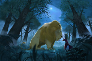
I’m going to take a moment to talk about the composition itself. During the middle of painting, I made a new layer to make some visual notes for myself as I paint. Sometimes I can get too involved with a painting to the point where it’s like I have blinders on and the painting deviates from the main idea. So it helps to step away once in a while and assess the progress of the painting.
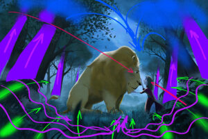 I know these notes look like they were scribbled by a toddler, but there’s an order to this chaos, I hope. What these lines are illustrating is the “flow” of the image, in other words, how your eye moves around the painting. My main goal is that eventually your eye will be led back to the space between Aslan and Lucy. For example, the two red lines are showing the direction of the main line of action which runs diagonally from top left to bottom right. If I’m successful, this is the line that your eye will tend to move along when you first see the painting, and the space between Aslan and Lucy is where your eyes will eventually rest. You’ll also notice that the left tree’s face and the ferns at the bottom right are also aligned along that same line.
There are also a secondary “paths” that your eye can travel along as you’re looking at the image. The tree trunks, highlighted in purple, will tend to move your eye up towards their canopies which blend into the clouds. Eventually the sky should lead you back towards Aslan and Lucy like sand through an hourglass. It’s not obvious to the everyone when they look at this image, but my goal is that you feel it subconsciously.
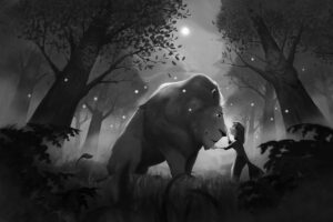 Another thing I should mention is that as I’m working on the piece, I’m constantly checking the value structure of the piece; or in other words, I check the image in black and white. The reason I do this is because it helps make the image more readable.I could go into the technical side of things, but to keep it short, if an image reads in black and white, it will also read in color.
To check my image in black and white in Photoshop, I go to the top menu and select “View -> Proof Setup -> Custom”. In the dialog box, I select “Working Gray – Dot Gain 20%” in the dropdown next to “Device to Simulate” in the “Proof Conditions” section. You can select any option that will desaturate the image. Now when I hit “Cmd-Y”on my keyboard (or “Ctrl-Y” on a PC), I can toggle my view to see the image as color or in black and white.
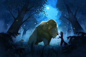
I noticed that I needed some complementary color to add some variation to all of the blue and green in the scene, so I decided to add some fireflies as a nice little highlight to the piece. The book didn’t specifically state outright there were fireflies in this scene, but I decided to take this liberty, and I like the result. I add more mist to blur out some of the details I was worried about earlier, and I think it adds a bit of mystery and emotion to the scene.
One of the fun things about working digitally is that near the end, there are a lot of cool adjustments you can make to enhance the image. In this case, I decided to add some noise and some slight color aberration to soften the image a bit. During my research, I also came across some lovely cover illustrations for the Narnia books that were done by Chris Van Allsburg. I didn’t want to necessarily replicate his style, but I wanted to have that softer feeling to my piece since it is a wonderful and magical moment in the story.
In addition to my wife, I also had my friend, Paul Comte, provide some notes for the piece. One thing I had failed to catch earlier was that Aslan and Lucy were positioned too far to the right and made the image a little unbalanced. So there was a little bit of work to reposition them and paint in new background, but it wasn’t too much of a drastic change. Having a second or third opinion on your work will always help.
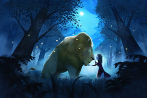 After many hours sitting in front of a computer and massaging hand cramps, I finally finished! I definitely learned a lot with this project, and despite the achy back and frustrating moments, I’m glad I was able to persevere and complete it. The final piece didn’t turn out exactly the way I thought it would, but I still enjoyed the process and am quite satisfied with the results. Maybe in a few years I will look back at this piece and cringe, but I think I will always be cringing at my own work for the rest of my life. At least it will show how much I would have grown by then.
Anyways, thanks for reading this post! I hope there are some of you who will find this interesting and perhaps even helpful. If you have any questions, or if you just want to say hello, please leave a comment below. I look forward to doing more posts like this in the future. In the meantime, stay safe and keep creating!
Cheers,
Nolen
